
One of the main reasons that I'm not converting any of my components to Joomla4 is that I make extensive use of the Bootstrap2 responsive row and column layouts for view. Joomla 4 switched to Bootstrap 4 (or maybe 5) which has changed the way you do a grid layout using container, row and col-xx-N instead of row-fluid and spanN.
This looked like a nightmare to change, let alone make a version that would work with both J3 and J4.
I did some research and no-one else seemed to be talking about this problem, plus there were various other compatibility issues as well, so I decided to stick with J3.
Yesterday I was struck by an thought - since the classes container, row and col-xx-N are (probably) not used in J3 and row-fluid and spanN are probably not used in J4 why not simply combine them for a version that would work in both so <div class="row-fluid" would simply become <div class="row row-fluid" which might just be a find and replace job. For spans you'd have to do a separate find replace for each value of N in <div class="spanN" which would be a bit more hassle, and you'd have to wrap each page in a <div class="container"> but at least it sounds feasible.
Turns out of course that its not quite so simple as using a derivitave of the Prostar template in J3 the row class is defined in the css having a negative margin of up to 30px which sends the composite off the screen.
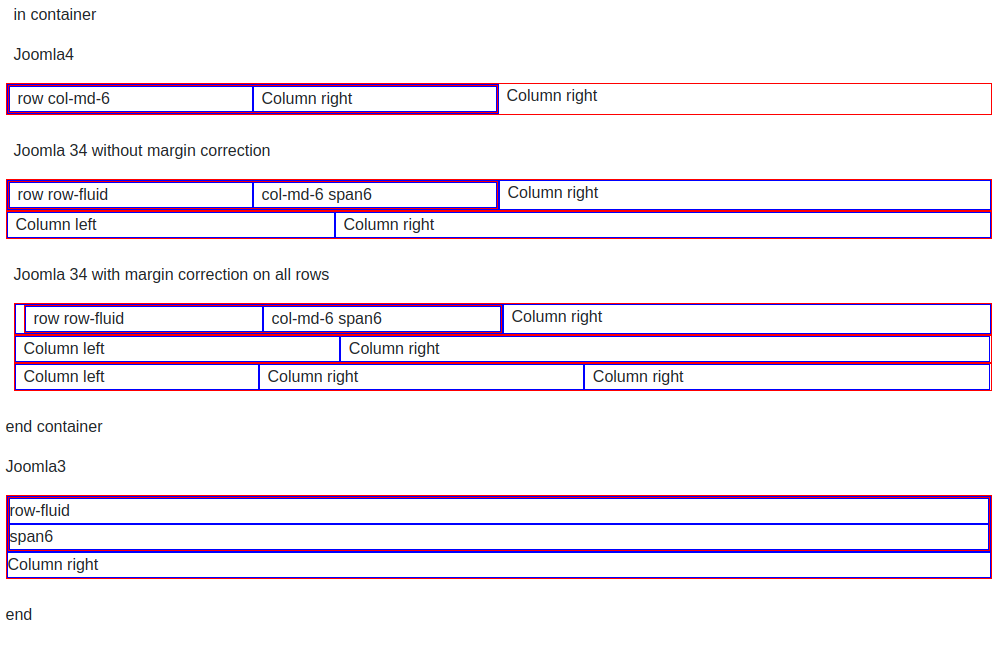
Adding a margin-left:0; sort of works as you can see in the screenshots below. Here's the code for the tests:
<div class="container-fluid">
	<p>in container</p>
	<p>Joomla4</p>
	<div class="row">
		<div class="col-md-6">
			<div class="row">
				<div class="col-md-6">row col-md-6</div>
				<div class="col-md-6"">nested row</div>
			</div>
		</div>
		<div class="col-md-6">Column right</div>
	</div>
	<p>Joomla 34 without margin correction</p>
	<div class="row row-fluid">
		<div class="col-md-6 span6">
			<div class="row row-fluid">
				<div class="col-md-6 span6">row row-fluid</div>
				<div class="col-md-6 span6">col-md-6 span6</div>
			</div>
		</div>
		<div class="col-md-6 span6">Column right</div>
	</div>
	<div class="row row-fluid">
		<div class="col-md-4 span4">Column left</div>
		<div class="col-md-8 span8">Column right</div>
	</div>
	<p>with margin correction</p>
	<div class="row row-fluid" style="margin-left: 0;">
		<div class="col-md-6 span6">
			<div class="row row-fluid" style="margin-left: 0;">
				<div class="col-md-6 span6">row row-fluid</div>
				<div class="col-md-6 span6">col-md-6 span6</div>
			</div>
		</div>
		<div class="col-md-6 span6">Column right</div>
	</div>
	<div class="row row-fluid" style=" margin-left: 0;">
		<div class="col-md-4 span4">Column left</div>
		<div class="col-md-8 span8">Column right</div>
	</div>
	<div class="row row-fluid" style="margin-left: 0;">
		<div class="col-md-3 span3">Column left</div>
		<div class="col-md-4 span4">Column right</div>
		<div class="col-md-4 span5">Column right</div>
	</div>
	<p>Joomla3</p>
	<div class="row-fluid">
		<div class="span6">
			<div class="row-fluid">
				<div class="span6">row-fluid</div>
				<div class="span6" >span6</div>
			</div>
		</div>
		<div class="span6">Column right</div>
	</div>
</div>
<p>end container</p>
<p>end</p>
And here's what that looks like (I have added a red border round rows and blue border round columns
|
In Joomla 3
|
In Joomla 4 |
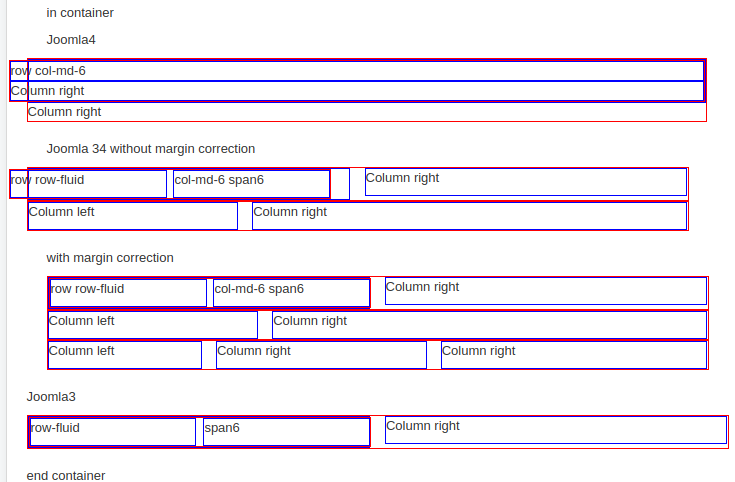
J4 is more or less ok apart from a slight offset at the start of the nested row
J3 with margin correction is ok but the total space occupied by the outer row is reduced and it is centred. Should more or less work though. It may be possible to refine this. This code is simply using style="margin-left:0;" to all rows, it may be possible to improve that by playing with first-child styles to reduce the offset and stop row limiting the width in a page or component stylesheet. But it seems it can be done to produce a fluid layout that works with both J3 Bootstrap2 and J4 bootstrap5.
Comments powered by CComment